Ashish
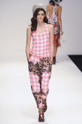


To me this man shows what it is really about, and that’s having fun. I love this collection even though I don’t think if I had the money I would go out and buy any of it, it’s just that it makes me smile and Ashish is so tacky and innovative with his use of sequins (you got to love a bit o’ bling bling every now and then.) I found his theme of what I would say is trailer trash quite interesting, I know the designer isn’t a major follower of trends but I thought it was a bit too off point. But I loved the idea behind merging different sequined patterns together on some of the garments. Apart from that I think other main topics of conversation about this collection would be the decorated cowboy boots and the headwear (some of which were balmy feathered headdresses inspired by Native Americans, as for the baseball caps they were a little too Britney Spears for my liking.
Basso & Brooke


The prints this season are a lot more toned down and less busy than last, never the less the collection is still lovely. The colours and the prints were very soft bar the few specks of black, yet the shapes remained quite tailored. Some reminded me a bit of the ones from the Alexander Wang collection for S/S 11 with the distressed almost flaking look of the prints. Another thing I liked about the prints were that there were some which were script, which is refreshing seeing as most people when they think of summer prints just assume or design florals. I really liked the dresses which had print on which was made to look like crumpled paper. The script and the overall romantic feel the collection had made me think it was inspired by love letters?
Charles Anastase


It was geek chic meets minimalism with block colouring thrown in. I loved the use of pastel colours from the baby blue to the lilacs as well as the choices of fabrics, which all seemed quite light and perfect for summer. The wedged heels looked quite nice and I liked the fact they were brightly coloured and the use of the frames was quite a fun/young idea. The translucent Capri trousers were a favourite of mine. There was one romantic looking dress that was made out of nude sheer and had been adorned with flowers covering the models breasts and not much else. Overall a collection filled with desirable romantic yet fun dresses, as well as a few cool trouser combo’s.
Christopher Kane


I swear I love this man more and more each season he is the definition of cool, and I love the fact that even though he has major hype and could show pretty much anywhere out of the four fashion capitals and people would follow him, that he stays true to his roots and still shows in London. ANYWAY a collection consisting of neon started off with outfits that looked like they were made out of a plastic material but had been lazer cut to look like lace, that then moved onto pleated lace dresses and then onto dresses with Asian styled prints one with lace panels and neon coloured trims. As well as lace blazers, which I’m sure will be desired by many and ripped off by the high street before you can click your fingers. The collection was so well cut and the fit of the clothes were amazing (well what can you expect from a designer who is obsessed with body conscious dresses!) Oh Christopher please just recognise me soon, let me be your muse or at least your bitch. I’m pretty sure I’d do anything.
Erdem


Delightfully romantic and full of lace, a collection inspired by the Ballets Russes was shown at Erdem. The colour palate started off white, cream and a blood red and then moved into floral prints, something which the designer knows ever so well. One of my favourite items was the knitted jumper with the floral stitching on as well as the patchwork floral dress, but then saying that pretty much all of it was equally as beautiful. Although you know the Erdem codes and what he’s going he will include in his collections, I never tire of him as he still manages to create innovative dreamy, romantic and lustworthy clothes that you’ll never get bored of.
Giles


Touching on numerous trends this season such as colour blocking and layering as well as 60’s and 70’s inspired garments came down Giles Deacons runway. The prints were fun and even though they were of eyeballs which you would presume would be gruesome and didn’t take away any of the outfits femininity, it just gave the garments more character. There were dresses that were very busty (which shows that even after last season the celebration of the bust and womanly figure still continues, also it ties in very well with his pal Katie Grand’s new issue of Love magazine which is dubbed “the tits issue”.) But I think the main talking point of his show wont be necessarily about the garments but more who was strutting their stuff down the runway for him, as models/WAG Kelly Brooke and Abby Clancy walked for him, as well as washed up popstar Kerry Katona sitting front row (all three women were featured in the latest issue of Love magazine also.) But overall there were definitely some lovely dresses that could be worn and a suit with a knitted vest over the top that caught my eye. With all the use of colour and print, it got me wondering whether he’s used his own line as a warm up for designing for Emanuel Ungaro. Well I guess we’ll just have to wait and see.


i


First it was vintage perfume bottles, then the ocean and last season she was inspired by royal families jewellery, this season what does she give us?? A collection full of print based on buildings and you know what I LOVE it. I’ve been following her since the beginning of her short yet brilliant time on runway and it's brilliant to see how she’s adapting and finding her own sense of style and finding out what she wants her clothes to say. I feel like I’m growing with her. Encorperating jewelery into her looks (which scores her more points as I love Lanvin and that’s what Elbaz does for the label >.<) this time round it’s a lot grander with chunky necklaces that have big gems hanging off them. I like the fact she’s still incorporating other materials into her designs as trimmings but experimenting with new ones like fringing where as last season it was lace, giving movement and for some garments 3d effect. The shapes of the dresses themselves were very modern and sharp cut. My favourite outfit would have to be the one with a structured skirt with cristals hanging off the bottom of it (it kind of reminded me of the old lamps with fringing you can get.) I enjoyed the fact she was playing with proportion and volume more with some of the skirts. I really cant emphisize how much I love and want this collection. All I have to say is the progression made each season is amazing and I cant wait to see what A/W 11 has to offer.


It was a mish mash of a lot of references. From the first look shown it reminded me of Christian Lacroix. I loved the colours used it was a romantic collection, a tad sinister at times but great fun. I thought the hair was very interesting as well as the layering and playing with proportions of things as some of the shirts and skirts looked quite large.
Paul Smith


Quite a masculine collection, not that I’m complaining as I love to wear a suit every now and then ;) There were a nice selection of suits and trouser and shirt combo’s, I thought the shirt and blazer styled romper suits were a bit more fun and had a young feel to them.
Sass & Bide


I really liked the accessories and the print in this collection. The jewellery looked like armour and I just loved the copper colour, it worked so well. The use of the tassles was quirky with the neck ruffles made out of them.
 The beauty blogosphere is all abuzz right now on the topic of Heidi Klum's finger waves in the front/bun in the back hair 'do she rocked Monday night at the amfAR Milano dinner during Milano Fashion Week. Being that I myself am one of the most glamazing beauty editor-turned-bloggers that ever lived (yeah, sometimes it's ok to toot your own horn, Glamazons, because if you don't who will?!) I feel that it's important to bring it up on this blog as well.


